
Topmarks fonts are designed to complement the way letter and number formation is taught in early years classrooms.
The Topmarks fonts have been developed out of the frustration of teachers, not finding fonts that completely match the letter and number styles that they teach, and not finding fonts that can be easily used and freely shared for teaching purposes.
The Topmarks fonts are ideal for teaching and have many uses, from printables, such as worksheets, posters and class display materials, through to digital technologies such as word processing, interactive whiteboard resources and on web sites. The fact that Topmarks Fonts are Free Software means that all these uses can be covered freely and easilly, without the extra costs and complications that restrictive licensing can bring into the classroom.
Also, to accommodate the variations in the way that letters and numbers are formed and taught, it is planned that the Topmarks fonts will contain alternative versions of some characters, so that teachers can make the font to appear exactly the way they need to in their classrooms.
From Muli to Topmarks
The Topmarks Fonts have been build directly out of the 'Muli' Font. In addition parts of the font 'Fauna', designed by Eduardo Tunni, have been incorporated into the Topmarks design.
The Muli fonts formed the backbone for the Topmarks characters, with the addition of some reshaping to introduce to Muli the 'handwritten direction' that was needed. The curved terminals use to accentuate the 'out strokes' on many of the lowercase characters of Topmarks, was taken directly from the Fauna font.
The letterforms of Topmarks have been shaped to enable easy character recognition.
When young children are learning to read and write it makes sense that the letterforms they use make character recognition easy when reading.
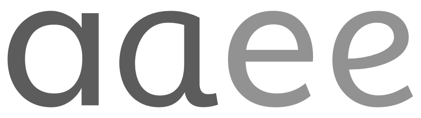
The letterforms of Topmarks have been kept simple and straightforward. Uniformity and repetition of form is used to amplify the similarity of some forms whilst amplifying the differences of others.

Traditionally, typefaces for reading are separate from handwriting, as they have different roots. Topmarks uses a type model that has it's roots in both hand written letterforms and book type.

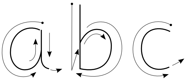
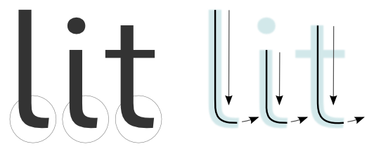
The letterforms of Topmarks have been shaped to help direct children in the best ways to write letterforms when writing by hand (see above).
'In strokes' guide the hand into each letter, and the 'out strokes' guide the hand to the direction in which the letter ends and on to where the next letter starts to be formed.

The form of each letter makes writing more straightforward and helps the formation of each character flow into the formation of the next character. These movements complement and underline the standard ways in which handwriting is taught to early learners.